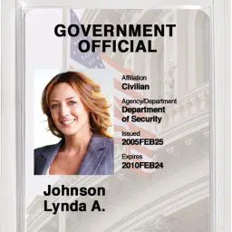





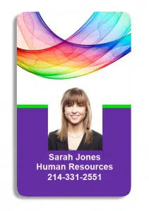
 It seems that every day our world is becoming less and less tangible. Everything we do is online and requires very little social interaction. Because our lives now revolve mostly around this visual stimulation, graphic design is at an all time high. People want to see something simple and beautiful when they are surfing the web and this stands true for everything that we do. Yes, even your photo ID cards. The truth is, people are simply more interested in something that is graphically pleasing. An old, outdated look simply won’t do. Everything and everyone else is keeping up with new graphic trends and you should too.
What do people want to see?
What people want to see varies pretty widely depending upon where you live and what line of business you’re in, so it’s up to you to understand your target market. However, there are some generalities that everyone can apply when revamping their photo ID cards.
- Simplicity is golden.
- Don’t have too much going on. Help the people see what they need to know by removing the obstacles.
- Give the people the information they need concisely and precisely.
- Display only the most important text. (Names, Titles, Positions, etc…)
- Use a relevant color scheme.
- If you’re unsure about what colors go well together, insight the help of an expert. There is plenty of free help available online.
- It’s best to stick with only two or three colors. This is not absolute, but keep in mind that too many colors can be overwhelming if they’re not used properly.
- Establish the focus.
- Answer this question: What do you want your customers to see right off the bat?
- One of my graphic design friends said, “If everything is #1, nothing is #1.” In other words, define what you want to be the focus and let everything else be a supporting role.
- Make your most important information the easiest to see.
We would love to hear from you! Leave a comment below. What are your tips for designing the best photo ID card?